Common maths mistakes in B2B content – and how to overcome them
There are several mathematical misconceptions that are surprisingly common in B2B copywriting. Here’s how you can avoid them.

You’d think being a copywriter would mostly involve writing, well… copy. But for B2B copywriters, maths is a big part of the job too.
In this blog, I’ll offer some tips to help you overcome the most common misconceptions we see around numbers and statistics in B2B content.
Breaking big numbers down is good for understanding
Like many elements of writing, it’s best to keep numbers simple.
The Royal Statistical Society’s (RSS) ‘Statistics for Journalists’ course recommends breaking big numbers down and scaling small numbers up.
(In fact, there’s all sorts of recommendations in the RSS course, which might be why it got glowing reviews from Lucy Rycroft-Smith of Cambridge University when she joined us on the Radix podcast: Good Copy, Bad Copy 78: Maths for B2B Marketers.)
In short: it’s easy to get lost when trying represent extreme numbers – whether that’s billions and trillions or numbers to five decimal places (0.00003).
Instead, deal with huge or tiny numbers by putting them on a scale your audience can relate to.
For example, let’s say you’re writing about the very fictional B2B copywriting company ‘Cadix Rommunications’. It sounds impressive to say the company writes a million blog posts a year, but sometimes big numbers that end with ‘illion’ can feel so big they’re unimaginable. They’re not meaningful to a reader.
But it might be meaningful to scale those one million posts a year down to 83,000 blogs a month or 20,833 blogs a week (give or take a recurring .3).
Say ‘Cadix Rommunications’ employs 100 people. You can go even further by saying those 20,833 blogs a week represent an average of 208 blogs per person. That’s much easier to imagine (even if it’s much harder to believe).
This advice also works in reverse. Avoid small percentages like “0.003% of Cadix Rommunications’ website traffic came from the International Space Station”. It’s easier to understand decimals that are scaled up (e.g. ‘3 in every 10,000’.)
You can also help your reader visualise extreme numbers by comparing them to well known objects. For example, if the ‘Cadix Rommunications’ office drunk 8,333,333 average-sized cups of coffee, they’d fill one Olympic size swimming pool. (This one’s much easier to believe.)
Percentages and percentage points
Percentages are an effective way of scaling numbers for comparison. Something is set as 100 and then everything else is worked out in relation to that.
But people often confuse percentages with percentage points. Here’s an example to demonstrate how easy it is to make a mistake:
Last year, Shmavid, a very fictional employee at ‘Cadix Rommunications,’ wrote 2% of the total blog post output (one million blog posts). And this year, he wrote 2.5%.
If Shmavid wrote 2.5% of the blog posts this year and 2% last year, then it’s tempting to guess that Shmavid’s output increased by 0.5%. But that’d be wrong because you’re measuring in percentage points, not percentages.
Shmavid’s actual output increased by 25%.
Looking at the absolute numbers, Shmavid wrote 25,000 blog posts this year (2.5%) and 20,000 blogs last year (2%). That’s an increase of 5,000 blogs and 25% of his output from last year (because 5,000 blog posts are a quarter or 25% of 20,000 blogs).
So, Shmavid’s actual blog post output increased by 25% from last year to this, and by 0.5 percentage points (the difference between 2.5% and 2%).
It’s also worth noting that if the situation David’s was reversed and David’s output decreased from 25,000 to 20,000, it would only be a 20% decrease. That’s because 5,000 blog posts are a fifth or 20% of 25,000 blogs.
But the percentage point difference, from 2.5% to 2% of the total output, would stay the same (0.5, except it’s decreasing and not increasing).
If you’re ever in doubt, head to this handy percentage change calculator. Lucy also shared a lot of other great recommendations on how to handle percentage changes in the 78th episode of the Radix podcast: Good Copy, Bad Copy 78: Maths for B2B Marketers.
If nothing else, just try to remember that:
A change in numbers refers to percentages.
A change between percentages refers to percentage points.
Percentages: bonus tips
- Be careful when you’ve got increases greater than 100%. If your blog post output increased by 100% it’s simpler to say it has doubled. But be careful because it’s a common mistake to assume a 200% increase is doubled, a 300% is tripled, 400% is quadrupled, etc… but it’s not, because you’re adding to the amount your already had.
- If you’re talking about just percentage points, it’s often clearer if you mention the actual number that’s changed as well.
Displaying data? Choose the right format
If you can avoid writing numbers on their own, then do because it makes things easier for your reader. Draw a graph, mock up a chart, get into excel and track your increasing blog post output. Take this example:
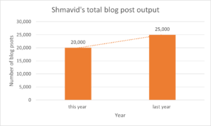
Displaying the data from my earlier example in a bar chart gives the reader the same information without all the written explanation. By just glancing at this graph, Shmavid’s increased blog post output is immediately obvious and it still includes the absolute numbers (Shmavid’s actual blog post output) as well.
It also provides a visual cue for calculating percentages because the bars are split into sections for every 5,000 blog posts.
But don’t assume visualising data is error-free. A common mistake is using the wrong type of graph or chart to represent your data type. For example, you could show the same information like this:
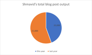
Displaying the same data in a pie chart does give the reader the same information, but it’s much less clear because pie charts are designed to show contributions to an overall whole. Shmavid’s increased output over time isn’t as clear to see and a pie chart provides little visual support in calculating percentages. So choose wisely.
I’ve got the percentages right. Are we done now?
Unfortunately not.
While your stats and percentages may now be technically accurate, they still may not mean quite what you think they mean. While it’s easy to throw figures out and assume we now have instant, objective authority, the reality is data is not as objective as people like to think.
‘Mathwashing’ is the name given to taking fundamentally subjective opinions and turning them into stats, suddenly creating the impression of rational and objective information.
Question your statistics and where they’ve come from. When writing about polls and surveys in particular, it’s important to know who and what is being asked.
Understand that no poll can ever be truly representative – not even the UK census (that is a crime to not complete) succeeds in asking everyone in a given group.
You can assume for most surveys that a proxy measure is used: an indirect measure of an outcome. For example, a blog post’s audience might be measured by the number of clicks but there’s no way to know how much the people who clicked actually read.
Get the confidence to check the maths
Whether you’re writing or reviewing a piece of content, you’re just as responsible for the accuracy of the numbers as you are the words and grammar. Make sure you’re confident enough to identify and fix mistakes.
In this post, I’ve collated some of the most important maths tips and explanations for B2B marketers and content creators to know. But the RSS’s ‘Statistics for Journalists’ course also delves into the margin of errors, confidence intervals, how we can define relative and absolute risk, the difference between correlation and causation, and what the regression to the mean really is.
By all means check out the course for yourself, and maybe listen to Good Copy, Bad Copy 78: Maths for B2B Marketers, which, if you’re feeling confident, includes a test to see how much you really know.
Further reading

The Radix Team
Wider team
Since 2007, the Radix team has worked with B2B tech companies and agencies to create compelling content. With an average of 9+ years’ experience, our writers have the expertise and talent to communicate complex tech propositions with clarity, credibility, and creativity.